Unifying the experience for small business and corporate banking clients.
Client
Bank of Montreal
Sector
Banking
Platform
Mobile Application
Role
Senior product designer
Timeline
4 months
Live product
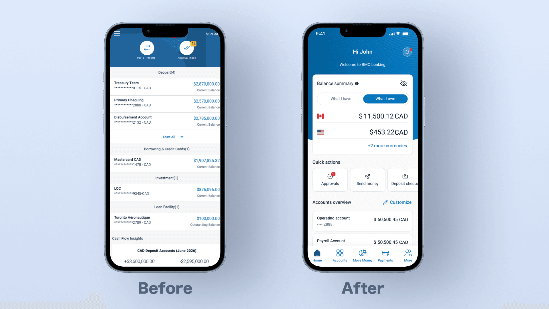
BMO's business banking app hadn't evolved since 2013, and users were leaving. I redesigned the homepage and accounts experience into one shared system for small business and corporate clients, then ran usability testing with real users from both groups to confirm the flow held up under real conditions.
At a glance
BMO's mobile banking app was built for corporate clients in 2013 and never kept pace. As small business owners grew to nearly half the user base, both groups began leaving for competitors with better experiences, costing BMO 23% of its users over three years. BMO brought in CGI to redesign the entire app, and as senior designer on the team, I led the homepage and accounts experience.

The problem
High-frequency tasks were buried behind multiple navigation steps, hidden inside a side menu instead of being available where users actually needed them. Large account portfolios were hard to scan at a glance, and core actions had no real prioritization. Every action sat in the same hierarchy whether you ran a five-person shop or managed fifty accounts, so small business owners lost time hunting for basics that corporate users never even noticed.
Old app hides key banking actions in the side menu, adding extra steps to complete common tasks.
I redesigned the homepage around the tasks users perform most often, bringing key actions, account information, and financial insights into one place instead of spreading them across multiple screens. I designed a shared experience that works for both small business and corporate clients, adapting to different user needs without splitting the product into separate journeys.
The result was a faster, easier-to-navigate experience with fewer steps to complete everyday banking tasks. In testing, both small business and corporate clients used the shared homepage naturally, including adopting the new pinned-accounts model with zero instruction.
New homepage brings key actions and account insights into a single surface.
These changes focused on restructuring how users navigate, prioritize, and understand their financial state within a shared mobile banking system.
1
Rebuilt navigation for high-frequency financial actions
Introduced a persistent bottom navigation pattern to reduce dependency on deep navigation and improve access to core banking tasks.
2
Optimized access to daily workflows
Brought key actions directly onto the homepage to reduce steps for common tasks like transfers and account operations.
3
Introduced lightweight account personalization
Enabled users to pin and prioritize key accounts, helping reduce cognitive load for users managing multiple accounts.
4
Unified financial overview on the homepage
Consolidated key financial information into a single entry point to improve clarity of overall financial position.
My role
Senior product designer
Led design direction for the homepage and accounts experience, two of the highest-traffic surfaces in the Online Business Banking (OLBB) experience.
Owned end-to-end design decisions including interaction design, information architecture, and cross-flow consistency across shared banking experiences
Worked closely with a peer senior designer leading adjacent domains (payments and money movement) to ensure system-wide consistency
Collaborated with product, research, and engineering teams to validate feasibility within a complex banking environment
Mentored a junior designer, supporting execution across supporting flows to maintain consistency across the broader experience
Our team
1 UX Director
2 Senior Product Designers (including myself)
1 Junior Designer
BMO
1 Product Manager
1 User Researcher
Engineering Team (Mobile Developers)
Deep Dive
This section highlights five product decisions that shaped the mobile banking experience, spanning system design, navigation architecture, user behavior, and technical constraints.
Approvals placement inside Quick Actions
The challenge
BMO proposed a dedicated Approvals section on the homepage for corporate users, which would introduce role-specific structure into a shared system used by both small business and corporate clients.
Decision & Rationale
I kept Approvals within Quick Actions instead of creating a separate section. This preserved a single high-frequency action layer where prioritization is driven by context, not role-based structure. It also avoided fragmenting the homepage into multiple entry points for similar tasks.
Validation & Impact
In usability testing, both small business and corporate users interacted with Quick Actions as expected. Corporate users consistently discovered Approvals within the same area as other high-frequency actions and did not perceive it as being misplaced or needing a separate section. Small business users naturally focused on their relevant actions within the same surface. Overall, the shared Quick Actions model held up well across both user groups, with users engaging with the content relevant to them without friction.
2. Homepage Account Overview
The challenge
Corporate users manage 50+ accounts, making the full Accounts page unsuitable for daily monitoring. BMO questioned whether surfacing accounts on the homepage duplicated the Accounts experience.
Decision & Rationale
I introduced a pinned account model on the homepage. This created a lightweight view for daily monitoring while keeping the Accounts page as the system of record. Users could define relevance through pinning without overloading the homepage.
Validation & Impact
Users quickly adopted pinning without instruction. A full-list homepage alternative reduced scan speed and increased cognitive load. The pinned model improved clarity while maintaining scalability for large portfolios.
3. Cheque Deposit Placement
The challenge
Cheque Deposit originally lived under Move Money, aligned with information architecture and grouped with other money movement tasks. However, product feedback suggested increasing its visibility, with a proposal to elevate it to the bottom navigation due to its perceived importance and frequent use in discussions with users.
Decision & Rationale
I kept Cheque Deposit within Move Money to preserve logical grouping of financial actions in the primary navigation. Instead of promoting it to the bottom bar, I introduced Quick Actions as a secondary access point on the homepage. This approach improved discoverability without overloading the primary navigation or breaking the existing mental model of where money movement tasks belong. It allowed users to access Cheque Deposit quickly when needed, while still keeping it within its logical category.
Validation & Impact
Users naturally discovered Cheque Deposit through Quick Actions for quick access, while still expecting and finding it within Move Money for structured workflows.The dual-entry model supported both behaviors without increasing navigation complexity or fragmenting the primary navigation system.
4. Alerts Section Technical Constraint
The challenge
A toggle-based model was initially designed for simplicity, but SMS alerts introduced cost implications and required account-level configuration, creating risk with instant updates.
Decision & Rationale
I replaced toggles with a step-based configuration flow. Users selected an account, chose alert channels, and confirmed changes before applying them. This ensured control, prevented accidental changes, and aligned with backend constraints.
Validation & Impact
Users felt more confident with the step-based model, especially for SMS alerts. The confirmation step improved perceived safety without reducing usability.
Before: Simple toggle-based alert controls per account
After: Account-specific alert configuration
5. Quick Filters on the Accounts Page
The challenge
Users frequently switched between currencies and countries but had to use a full filter flow each time, creating friction for repetitive tasks.
Decision & Rationale
I introduced quick filter chips for currency and country while keeping the full filter for advanced use cases. This separated high-frequency actions from complex filtering.
Validation & Impact
Users immediately adopted quick filters for daily switching, while continuing to use the full filter for advanced needs. This reduced interaction cost without limiting flexibility.
When User Testing Challenged Our Assumptions
This section highlights moments where initial design assumptions were challenged by user behavior or system constraints, leading to revised interaction models and improved outcomes.
1. Balance Summary Placement
Users expected immediate balance visibility on the homepage for daily financial decisions. I moved balance summaries to the homepage despite initial IA assumptions.
This shifted the homepage from purely task-based to both awareness and action. Users reported improved clarity and reduced need to navigate elsewhere.

2. Cheque Deposit Flow
Two versions of the cheque deposit experience were tested: an all-in-one experience and a guided step-by-step flow.
Users preferred the all-in-one experience, as it provided upfront understanding of the entire process and greater control over execution. The guided step-by-step flow increased perceived friction and reduced confidence.
I adopted the all-in-one approach, reinforcing that task-driven workflows benefit more from visibility and control than progressive guidance.
All-in-One Experience
Users can upload cheque images, enter the amount, and review all information within a single screen before submission.
Guided Step-by-Step Experience
Users are guided through the deposit process sequentially, completing one task before moving to the next step.
Quick Actions held up across both user groups.
Corporate users consistently found Approvals within Quick Actions without perceiving it as misplaced; small business users naturally focused on their own relevant actions in the same space. Neither group needed a separate path.
Pinned accounts were adopted with zero instruction.
Users immediately understood and used the pinning model to manage large portfolios. A full list alternative was also tested and slowed scanning and increased cognitive load by comparison, confirming pinning as the stronger pattern.
Dual entry Cheque Deposit removed friction without adding navigation complexity.
Users found Cheque Deposit through Quick Actions when they wanted speed, and through Move Money when they expected structured workflows. Both paths were used as intended, with no added confusion.
Quick filter chips were adopted immediately for daily use.
Users switched to quick filters for repetitive currency and country changes while still using the full filter for advanced cases, validating the two tier approach.
