Enhancing customer experience for small business banking
Client
Scotiabank
Sector
Banking
Platform
Responsive Web Application
Role
Timeline
7 months
Live product

Scotiabank's small business application had a completion rate as low as 33 percent, held back by long forms and a rigid product selection flow. I redesigned the flow around how people actually move through it, breaking forms into steps, making product selection fully revisable, and replacing a silent save with one people could trust. Completion rate improved to 64 percent.
At a glance
Scotiabank launched its small business digital application portal in the early 2000s with little attention paid to how users actually experienced it. Over time, completion rates declined, raising concern within Scotiabank's small business team. I was brought in as senior product designer, working alongside a junior designer already on the team, to identify the core usability issues and redesign the application experience to drive completions.
The problem
The application was built for a straight line through, fill it out top to bottom in one sitting, with no accommodation for how people actually behave. Long, undifferentiated forms made the effort feel heavier than it needed to be. Once a decision was made, there was no way back to revise it without restarting entirely. And anyone who needed to step away lost their progress with no visible way to return. Small business owners don't move through an application that cleanly, and the product didn't allow for that.
Before: A single, dense form with so much content visible at once that starting felt overwhelming.
I redesigned the application around how people actually move through it rather than assuming a straight line to completion. Long forms were restructured into a tabbed, step based flow instead of one long scroll. Product selection became fully revisable, letting users switch between chequing, savings, and credit and change an earlier choice without restarting, with a persistent cart showing running cost across everything selected so far. And I rebuilt how the application handled someone stepping away, replacing a silent, invisible save with an explicit save action, a confirmation, and an email backup, so leaving never meant losing progress.
The redesigned form, broken into tabs, with users clicking through each section instead of scrolling one long page.
These changes focused on removing the specific points of friction where users lost progress, lost track of their choices, or lost trust that the application was actually working the way they needed it to.
1
Made saving progress visible and trustworthy
Replaced a silent save with an explicit action and confirmation people could actually see and trust.
2
Restructured long forms around a forward moving flow
Broke one dense, overwhelming form into a step based structure people could move through with less friction.
3
Gave users room to change their mind without penalty
Let users move freely between product categories without fear of losing progress or needing to restart.
4
Introduced a cart style view so pricing stays visible and consistent
Gave users a way to compare cost across products without losing track of what they'd already chosen.
My role
Senior product designer
Our team
Senior Product Designer (myself)
1 Product Manager
1 UX Researcher
1 Business Analyst
1 Junior UX Designer
Front end and Backend Developers
Deep Dive
This section highlights five product decisions that shaped the mobile banking experience, spanning system design, navigation architecture, user behavior, and technical constraints.
Making the Save and Return Safety Net Actually Visible
The challenge
Early in the project, interviews with applicants surfaced a consistent pattern. People frequently needed to pause mid application to retrieve a document or a detail they didn't have on hand, a business number, a partner's information, something they'd need to walk away and find. Pausing wasn't an edge case, it was a normal part of how people actually completed this application.
Analytics confirmed this was costing completions. Drop off was concentrated among users who weren't yet existing Scotia customers, the same people who couldn't finish the application in one sitting. When I tested the old design, users had no visible way to save and return to their progress. There was no confirmation on exit, no email, and no indication that retrieving a saved application from the site was even possible. From a user's perspective, leaving meant starting over.
Together, the discovery research and the analytics reframed the problem. The design needed to give users a clear, visible, working way to leave and come back, so pausing never became permanent.

No save option, no confirmation, nothing told the user their progress was safe.
Decision & Rationale
My first attempt was a simple "Save" button on the exit flow. When I tested that with new participants, it still wasn't enough. People told me it wasn't clear what "Save" actually meant or where they'd go to pick it back up. I'd assumed adding any visible save action would solve the trust problem. Testing showed the label alone couldn't carry that weight, and the moment needed to be made explicit, not implied.
Working with the content team, I redesigned this around a clear primary moment with a backup. Clicking "Save and finish later" led to a full page confirmation on the spot, stating the outcome, not just the action, with real visual weight instead of a silent background save. A confirmation email was sent as a backup, so users still had a way back in even if they closed the tab without registering the on page confirmation. Together, they answered the exact question users had no answer to before, how do I get back.
Validation & Impact
Working with our user researcher, I ran a moderated study with 6 participants sourced through UserTesting, screened specifically for non Scotiabank customers, the exact segment analytics had flagged as the source of drop off. The study compared both versions using the same interruption scenario. Participants were given a task to begin filling out the application, then interrupted with a cover scenario, a call pulling them away from their desk, with an instruction to keep in mind they'd be returning to finish the task, long enough for the session to time out.
With the old design, participants had no clear way back into the application when they returned, confirming what discovery had pointed to and analytics had flagged, users had no reliable path back once they left. With the new design, participants clicked "Save and finish later," saw the full page confirmation, and on return, successfully used the confirmation email as backup to get back into their saved application. The comparison confirmed the redesigned save and resume system directly resolved the specific failure the old design produced, for the exact population the fix was targeting.
2. Reducing Cognitive Load in Long Form Applications
The challenge
Watching users move through the existing application, a clear pattern emerged. Shorter pages were filled out quickly, while longer pages consistently slowed users down, with more hesitation, more re reading, more time spent before moving forward. The form asked for a lot at once, and presenting it as one long, undifferentiated page made that load feel heavier than it needed to be.
Decision & Rationale
My first attempt was an accordion style layout, collapsible sections on a single page, chosen because it was already a familiar, established pattern elsewhere in Scotiabank's forms. When I tested it, a real problem surfaced. Users would land on a page and simply forget a section was there to open, since it was collapsed and easy to overlook. Some moved on without realizing a required section hadn't even been expanded yet. Testing also surfaced a broader signal, users responded better to a horizontal, forward moving flow than to a vertical one where everything technically existed on the same plane, expanded or not. I'd assumed accordion would reduce perceived length without any real cost. Instead it introduced a worse problem, content going missing entirely, and pointed me toward a different direction, a tabbed, step based structure where each section is forced into view in sequence, with nothing left optional to open.

The accordion attempt, where a collapsed section was easy to miss entirely.
The tab format also read as more clearly clickable and interactive than the accordion had, which reinforced the shift. Rather than passively expanding a section that might get missed, users saw a set of distinct, actionable tabs, and could move back to previously completed ones to review or correct their answers, aside from the one restricted step covered below.

The finalized tabbed version, where every section is forced into view, nothing left to miss.
Validation & Impact
This was validated through direct observation rather than a formal quantified study. Watching the same users move through both the original long scroll version and the accordion version surfaced the missed section problem directly, and that same observation pointed toward the tabbed, step based direction as the fix.
3. Making Product Category Switching Feel Trustworthy
The challenge
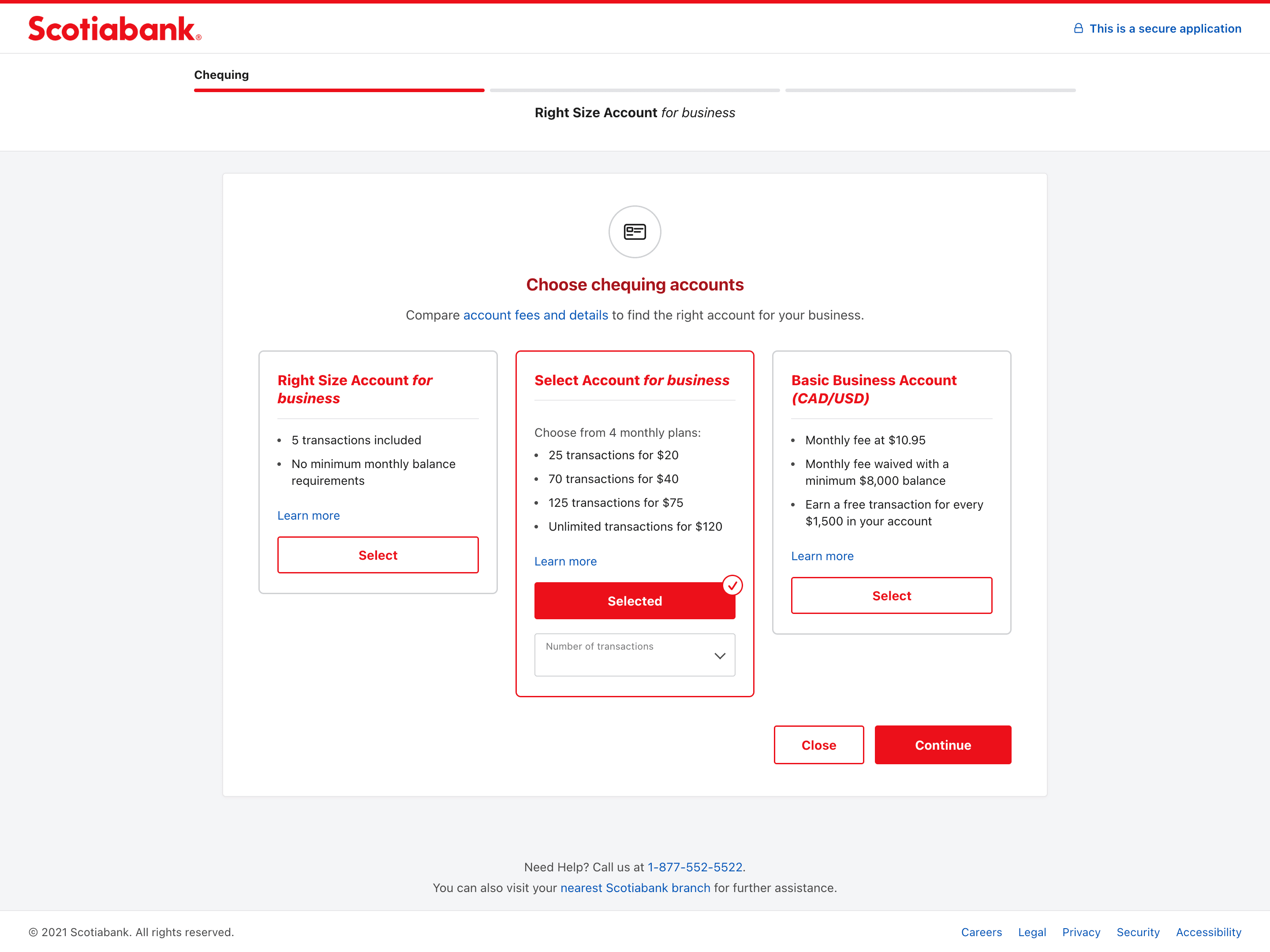
Users landed on the Product Selection page with a product already defaulted, based on what they'd clicked "Apply now" for on the main business page. As they moved forward, comparing chequing, savings, and credit options, some realized they wanted a different product than the one they'd started with. With chequing, savings, and credit each living on separate pages, users had no reliable way to go back and change an earlier selection, so the common outcome was closing the browser and restarting the entire application from scratch.
Decision & Rationale
Rather than assume a fix without checking feasibility, I talked with engineering to understand what was actually possible. They confirmed that switching between the three product categories, chequing, savings, credit, was technically feasible, and that the separate page structure was a design choice, not a hard constraint. Instead of introducing a new interaction pattern, I redesigned the three categories as tabs within a single page. Tabs already carry a familiar meaning for users, that content is switchable and progress is preserved, so this leaned on an existing mental model rather than requiring new instruction.
Validation & Impact
I ran a usability test where participants were given a specific task script, select a chequing account first, then move to credit, then go back and change the original chequing selection. Out of 10 participants, 8 completed this successfully, switching between tabs, revising an earlier choice, and confirming their change, without confusion or needing guidance. The familiar tab pattern gave users the confidence to move between categories and revise a choice, without fear of losing progress or needing to restart.
4. Giving Users a Way to Compare Value Across Products, Not Just Switch Between Them
The challenge
Research surfaced that before deciding, users cared most about two specific things, how much they were approved for, and what the monthly cost would be. Details like transaction history or account features, the kind of information people compare while researching options on Google before ever starting an application, weren't needed again at this stage, since that decision was already made. Yet in the old design, monthly cost and approval amount sat in plain text with no visual hierarchy, equal weight to those secondary details, even though they were the reassurance users actually needed at this point in the flow.
A second problem emerged once tabs let users move freely between chequing, savings, and credit. Users wanted to experiment, adding a product, checking the overall cost, removing it, trying a different combination, to find the best value for their budget. But there was no way to see an accumulated view while doing that. The only place to see everything they'd selected was a review page later in the flow, so users lost track of their running total the moment they moved to compare something else.
Decision & Rationale
My first attempt addressed the hierarchy problem directly, increasing the font size and prominence of monthly payment and approval amount within each product screen. Testing this version surfaced the real gap. Users would move to the credit tab to compare, then switch back to chequing just to reconfirm what they'd already selected and its monthly fee. That back and forth was the signal, users needed that confirmation visible at all times, without needing to switch tabs to find it.
That insight led me to a similar use case in ecommerce, where browsing multiple items still keeps a running total visible at all times. I introduced a persistent cart panel that worked alongside the existing tabs rather than replacing them. The cart carried forward the same prominence from the font fix, monthly cost and approval amount lived clearly inside the cart summary, and stayed visible and accumulated across every tab, so users could add, remove, and compare products freely without needing to switch back just to check what they already had.
Validation & Impact
In testing the finished cart design, 8 of 8 participants successfully added a product to the cart without guidance. Participants described feeling confident in the system, which gave them the freedom to move back and forth between products without losing track of their choices. Testing also surfaced that this decision isn't always made in one sitting, some users add a product to the cart, step away to research further, and return days later to swap it for something else. The cart supported that longer decision timeline as well, not just quick comparisons within a single session.
The save and resume system resolved the exact failure it targeted.
Participants who had no way back into the old design successfully returned to a saved application using the new confirmation and email backup, for the specific population analytics had flagged.
The tabbed structure fixed a problem the accordion had created.
Watching users miss collapsed sections directly led to the step based redesign, and every section has stayed forced into view since.
Product category switching removed the restart problem entirely.
Eight of ten participants successfully revised an earlier product choice without confusion or guidance.
The cart panel solved a problem a simpler fix could not.
Making monthly cost bigger did not stop users from switching tabs to recheck their choices, the persistent cart did, with all eight participants using it successfully.
